
For Businesses
The Development Of The JoinDayo Logo
When we were developing the idea for JoinDayo.com, we wanted to have a distinctive, recognizable brand.
It was essential that we create a logo that instantly conveyed the feel and tone of JoinDayo- friendly, family-oriented,
clean and simple.
We had some ideas, and wanted the logo to feature a character to represent Dayo. We thought it would be nice to have an
"outdoor" scene, with trees, grass, and bright sunshine.
As we thought about it, we developed the idea of a large tree with a boy in a swing, the sun shining brightly overhead, and
the JoinDayo name in the foreground.
We then talked with an extremely talented local artist, and asked if she could come up with some sketches of what we wanted.
We met and, in the a very short time, less than an hour, she came up with these three designs.
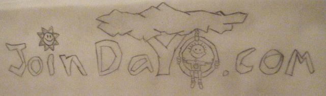
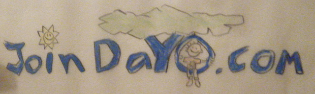
Since I have trouble visualizing the finished product, she colored it in for me. Here's what it looked like
This first design addressed the ideas we had. We wanted a little boy, "Dayo", with the name designed in.
This one had the right idea, but the text was too "blocky."
We didn't quite like the blue, and although we liked the sunshine, it seemed a bit too much to have it dot the "i."
We also thought that having the "y" as the tree might be confusing. We wanted to be sure that "JoinDayo" was readable.
So, she made a second pass.
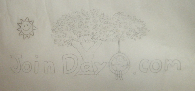
We loved it! The tree was better as a separate object. The letters were a lot smoother.
And Dayo looked a lot less like a kid's drawing.
We then took this drawing, which was done on vellum paper, and scanned it into Photoshop.
Once we had a scanned image, we colored it all in, and actually colored in each leaf separately, one by one.
We then made some small modifications, again using Photoshop. We made the tree a bit thinner, tightened up the lettering,
and brought the sunshine in closer.
We also made the tire swing a little shorter, so Dayo's feet would touch the grass. And we added in the grass!

As a logo and a brand, it's very effective, and we're really happy with it.
Now that we had the logo designed, we then set about turning the drawing of
Dayo into a real-life character.
Take a look at the process.